Written By:
Kseniya Dobrovolsky
You’re in a highly competitive niche and are on top of your game on sales-ready keywords. Thanks to your laser-targeted ads, people are clicking through to your landing page nonstop.
Everything seems fine and your conversion rates are bound to bounce through the roof. You’re on top of the world.
But then you rub your eyes and reality sets in. You check the numbers and are now in complete dismay at the unbelievably low number of people who turned into leads through your landing page.
The problem isn’t the product, the ads or the keywords—the problem stems from forgetting to optimize your landing page effectively.
Luckily, forgetting about landing page conversion rate optimization is a common occurrence in the world of digital marketing, and there are several actionable tips you can take and apply to your landing page right away to improve clicks and conversions.
Even if your inbound campaign is currently profitable but you’ve failed to completely optimize your landing page for the highest conversion rates, the glory will probably be short-lived. A landing page that lacks optimization is a leaking ship that is bound to cost you revenue in the long term.
With this said, here are three actionable conversion rate optimization tips for landing pages.
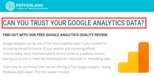
Check Your Headline
It is one of the first things visitors see when visiting any web page and can actually make or break conversion rates. In fact, according to Copyblogger, only 2 out of 10 people read below the headline!
That’s an insanely frightening number of people who will never know what your brand has to offer! This is why a catchy, engaging landing page headline is so vital to campaign success.
A landing page headline should be both targeted and compelling, enough so that strangers will care enough to read what comes after the headline.
Here are a few quick tips for crafting effective landing page headlines:
- Clear and concise. Clear headlines that get to the point and avoid fluff are almost always guaranteed to be more effective than headlines that come across as “salesy” or overly persuasive.
- Only you can solve their problems. Your visitors are facing some type of problem, otherwise they wouldn’t click on your ads. The headline should in some way mention how you can solve their problems. This is your value proposition and its importance cannot be understated.
- Try using testimonials or case studies as your headline. A customer testimonial, whether real or carefully crafted, can contain the elements above and instill an added sense of trust in the consumer. Try using a testimonial as the headline and case studies as subheadings.
- Humor is great. Everyone loves the funny guy. If you’re not funny, hire a skilled copywriter to do the heavy lifting. If a funny headline can be tied in as a question, then even better.
Lead Capture Form Optimization
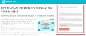
Your lead capture, or lead generation form, is the easiest place to start optimizing a landing page for better conversion rates.
Here’s a helpful form tip: Ask as little as possible. A variety of studies have indicated that the more information you ask of visitors, the lower the conversion rate will be.
People don’t want to spend “X” amount of time filling out forms for a product or service they may not even want. Even without filling in a single form field, people will look at how much information is required and make their decision to stay or leave on that fact alone.
Asking for too many form fields is a problem particularly in the B2B software industry.
A few fat-trimming solutions:
- Make the form design visually simpler.
- Make the copy bigger and more legible.
- Ask for their “Name” as opposed to their first and last names.
- Forget about asking for their company name. That information can be acquired later.
- Get rid of multiple phone number fields. Instead of asking for people’s home, cell and work phones, ask for their “Primary” phone number.
Switch Up Button Colors, Shapes and Sizes
Don’t think that companies like Amazon, Apple and Target use a rounded corner button in their designs for no reason. Button colors, shapes and sizes play a massive role in conversion psychology.
Your landing page’s buttons are usually the thing you want clicked on the most, so it’s important to ensure your call to action and “Add to Cart” buttons are fully optimized for your brand, audience and message.
- Color: Make your buttons pop by picking a color that contrasts from the colors on the rest of the page. You want the button to stick out, not blend into the rest of the design. Orange is readily accepted as an excellent color to get people to click due to the fact that it invokes a “buy and sell” energy. Red is another great button color that instills a sense of urgency and can potentially work better than orange. Test button colors to find the one that bodes well with the majority of your audience and receives the most clicks.
- Shape: Buttons containing sharp corners generally don’t convert as well as buttons with smooth, rounded corners. There are several reasons for this. Round corners are easier for the brain to process, people have been conditioned to be cautious around sharp corners, and sharp corners tend to create an arrow effect that guides the user’s attention away from the button and the call to action that’s inside. Instead of sticking with one button type, mix it up and find which button types perform best in certain positions on the page.
- Size: This is the easiest button element to test. Make your landing page buttons larger or smaller, and find which size fits best alongside your optimal color and shape.

Take a few minutes out of your day right now to either improve some of your headlines, shorten a form or change a button on a page. Trust me, one of these small changes can go a long way.


